Component Design In Figma

Design System Series: Part 3, Creating design system components in Figma
Have a read of Part 2, Design Systems Thinking.
Getting reacquainted with Figma
When I focused on building the component library of my design system, Lagom UI, my brain went into delivery mode and prioritized what I knew. As a developer, I've built the component library entirely in code, including the documentation and the style guide. I have since achieved that milestone, and now, I'm working towards the next, iterating and scaling designs within Figma. The problem here is that everything I've done in Figma up to this point was creating mockups of how the actual pages of my website would look. There was nothing reusable to iterate or build on. Now was the time to work out the design side of my design systems mindset and build my react components into reusable Figma components.
Where to start?
Initially, I thought of building a button component in Figma. But, a button component is deceptively complex. It wouldn't be an appropriate avenue for learning in Figma. So, I decided to keep it simple. I started with a Page Header component that only needed three variations — different font sizes for three breakpoints.
Component variants
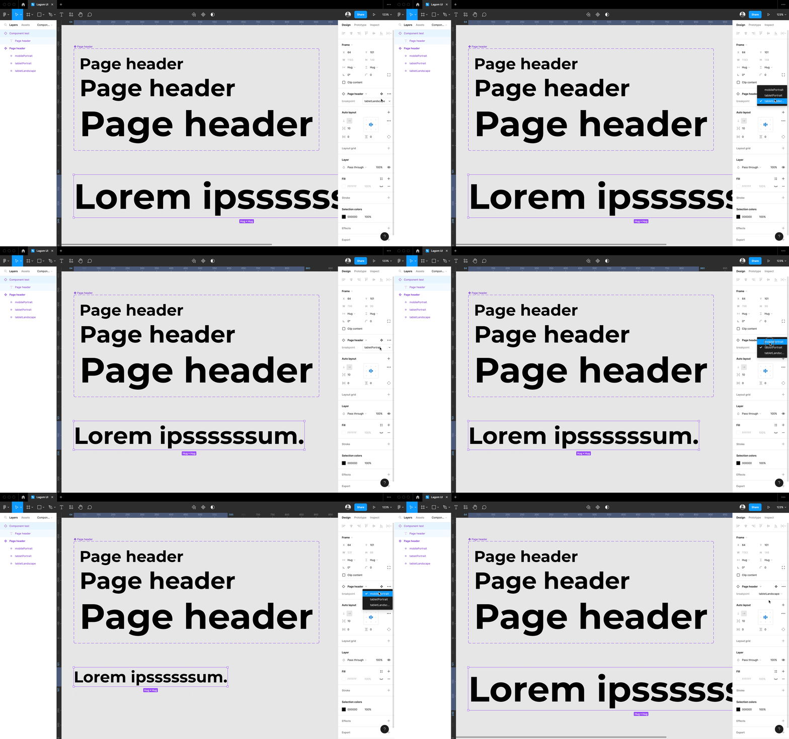
I wanted to create my Page Header component with the ability to change font sizes depending on the breakpoint. Unfortunately, Figma doesn't currently support breakpoints. To get around this, I implemented a breakpoint property in my Page Header component to choose the appropriate component variant for the viewport size. I was off to a good start. I learned how to create component variants for my breakpoint use case 🙌.
Component props
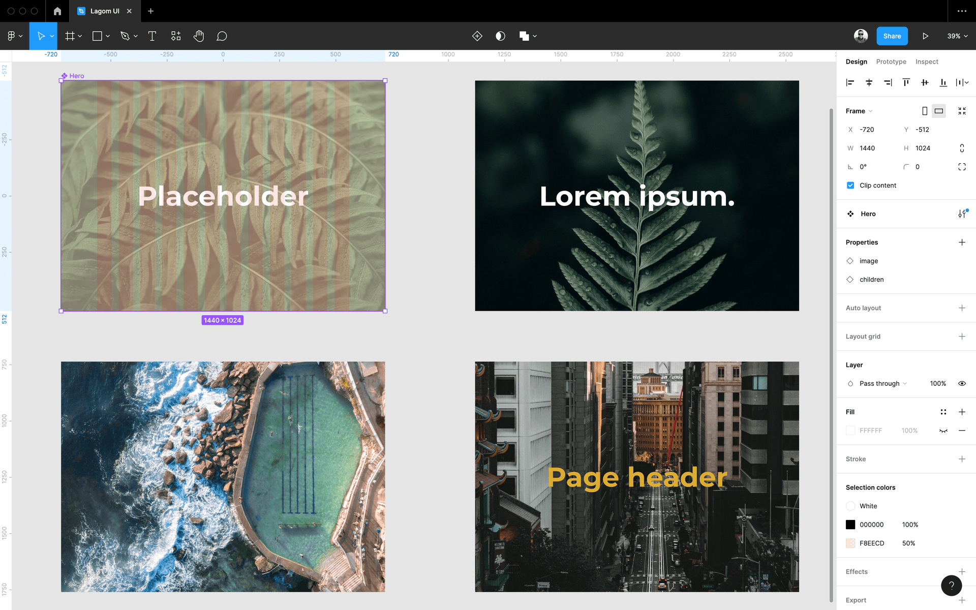
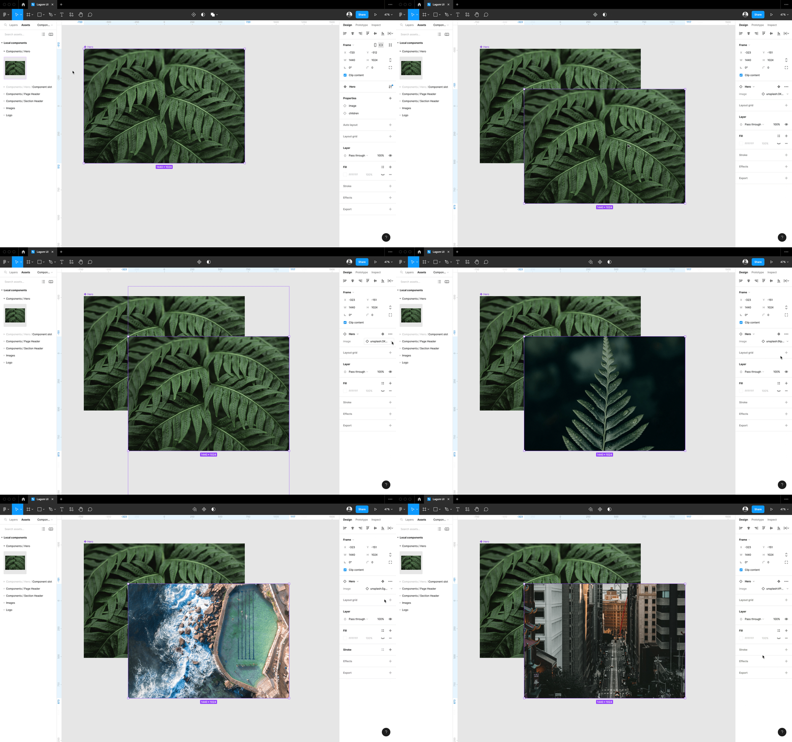
The next thing I wanted to learn in Figma was component props which would connect my developer thinking 🧠 of using component props within React. The component I chose to implement component props was a Hero component. This choice was a bit strategic as it allowed me to learn component props and component composition (which I'll get to in a bit). I created a container that filled the entire viewport width and height with an image. It was that image that was the prop of the Hero component.
Component slots
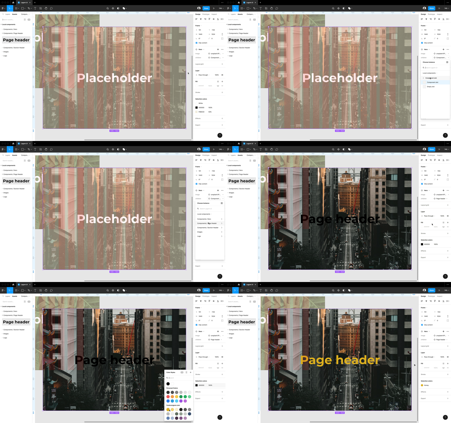
What my Hero component needed that I wanted to recreate in Figma was the concept of children in a React component, where the child component could be anything. I tried dragging a Figma component into another, but it turns out that Figma doesn't currently support this type of composition. This hurdle offered me just the right amount of friction to learn more about how to use Figma. I turned to Google and searched for "component composition in Figma" and stumbled upon an article about component slots 🕵️.
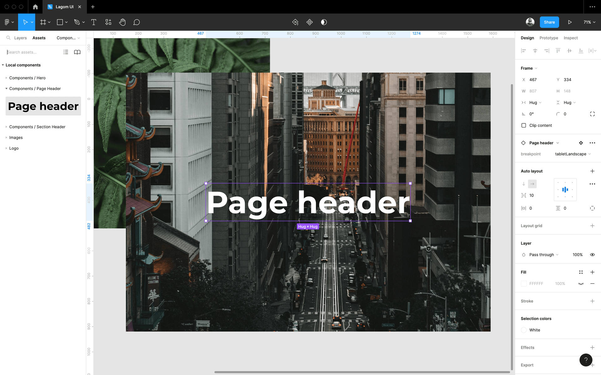

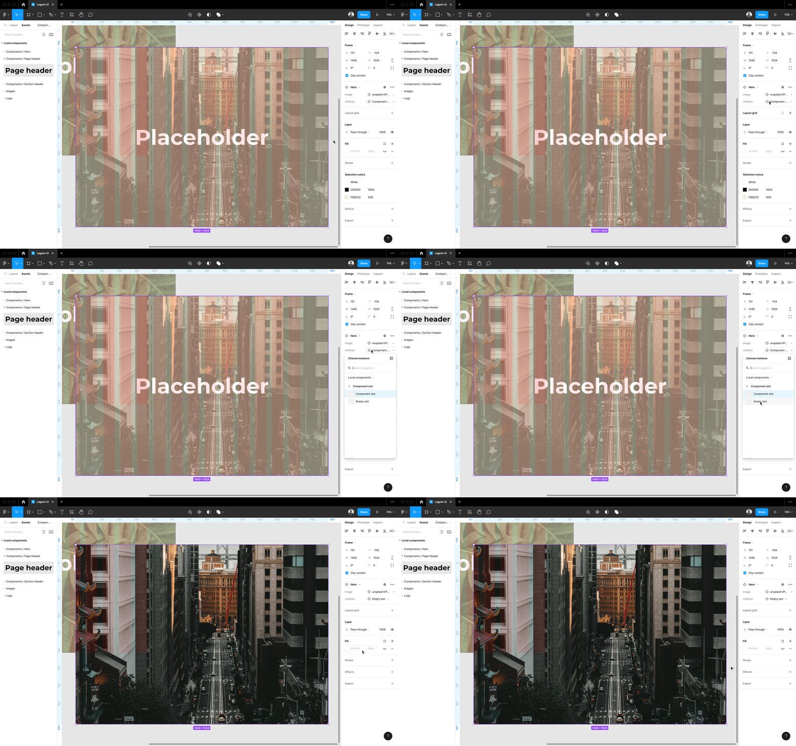
I thought about the use case of dragging one component into another, and it began to make sense why that wouldn't work. The parent component would need to define where the children would go. Enter component slots. Essentially, component slots define a "placeholder" within the parent component. That "placeholder" mimicked the concept of children in React, which got me what I needed for my use case. I also created an Empty Slot component to support when children is null.
Where to next?
I plan to create the rest of the react components in my design system, Lagom UI, as Figma components. Luckily, there isn't an extensive list of components. I've embraced the meaning of "lagom" and have "just the right amount" of components in my design system. Once I finish creating the remaining Figma components, I can play with experimental layouts and designs using the components directly in Figma.
Having my components in Figma will enable me to incorporate the Figma Tokens plugin into my workflow to create unique themes via design tokens for my websites. Using Figma Tokens was my main driver for getting all of my components into Figma. I'll talk to this more in a future post 👋.
