Creating a Component Library

Design System Series: Part 1, Creating a Component Library
This is the first post in an ongoing series of my journey into building a design system.
Component Libraries
When I began to grow into that space where design and development meet there was this friction that I initially felt when updating what I've already developed to match the updates that have been introduced into the designs. Through that friction is where I learned that the more reusable code (and later on design) I create, the less of an impact future changes will have on the whole.
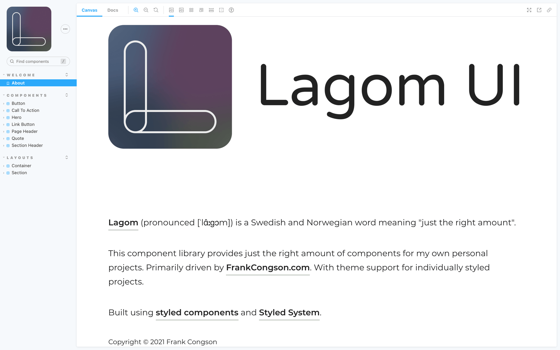
This experience is what led me down the road towards component libraries. I now had a collection of building blocks of code (built with React, styled with Style Components, and documented with Storybook) that I could piece together and build UIs at a fast pace. Take a look at the component library I've built, Lagom UI.
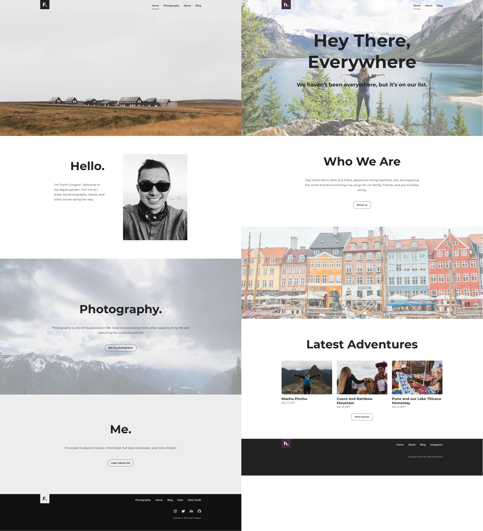
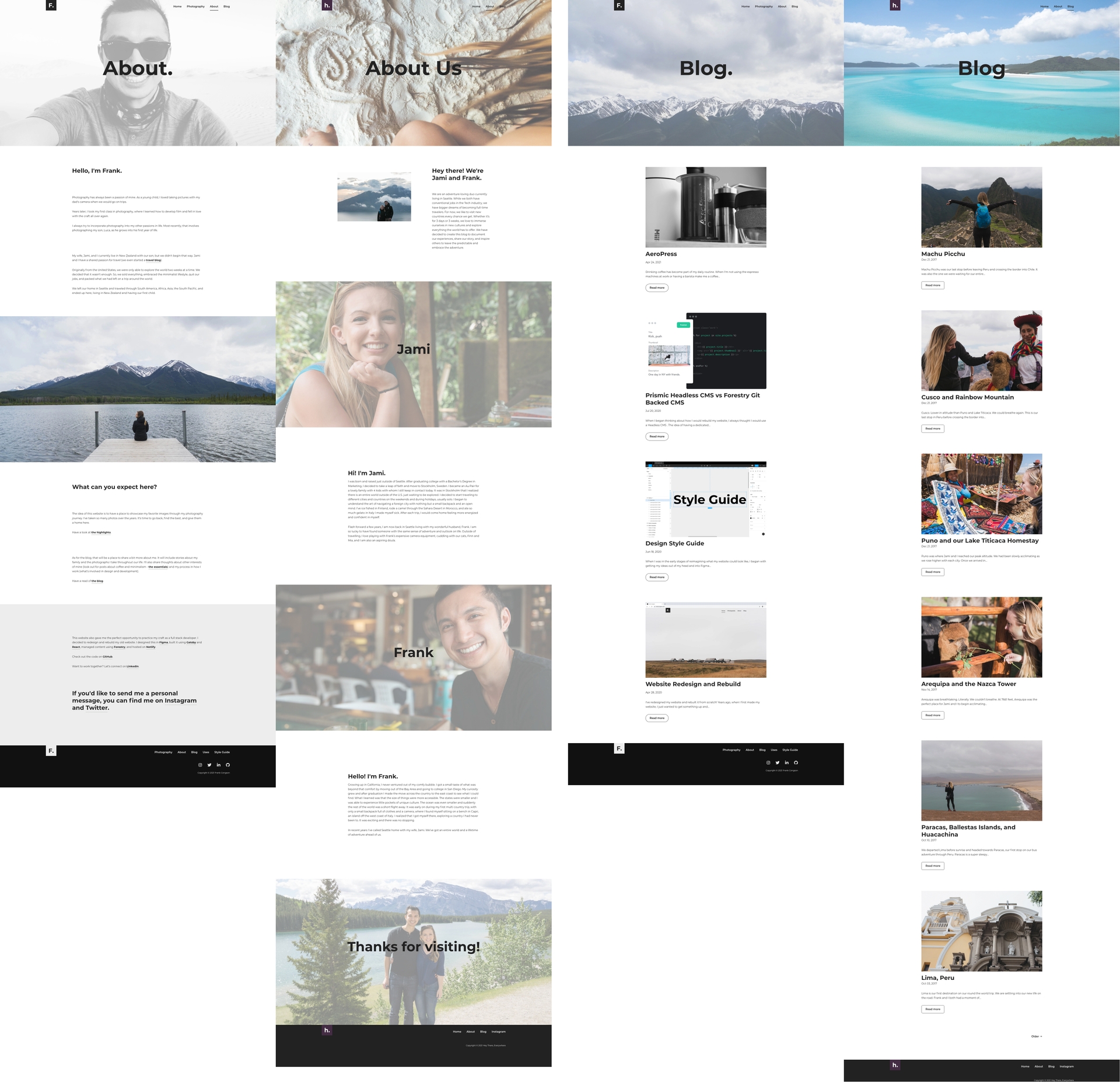
With Lagom UI, I was able to redesign both my website, FrankCongson.com, and my wife's and my travel blog, HeyThereEverywhere.com.

Themable Components
The problem I found with this approach was that both websites looked very similar. Which at first isn't a bad thing. They both belong under the same "brand". However, I did feel a bit restricted when I wanted to add something extra to one without having to affect the other.
Adding a theming system seemed to be the answer to this. Themes could define aspects of the design such as colors used, fonts, sizing, and spacing. Rather than trying to create my theming system from scratch, I decided to add Styled System to my codebase and used their Theme Specification as a guide to creating themes for FrankCongson.com and HeyThereEverywhere.com.
After adding themeable components, I was able to add some unique features to an individual website. This loosened the restrictions and was definitely on the right track of having the two websites with similar coded elements while maintaining individual personalities.

Usability and Discoverability
Initially, I created what was to become Lagom UI in the FrankCongson.com codebase. The HeyThereEverywhere.com codebase was its standalone repository. To avoid duplication I decided to pull out the components from the FrankCongson.com codebase and into their own. This was the birth of Lagom UI. I created an npm package that would be served on GitHub (found here: @fcongson/lagom-ui). Creating an npm package allowed me to be able to develop once and install it into both projects.
The discoverability of components is important for component library adoption. For this reason, I added Storybook to act as the documentation of Lagom UI and to provide a space for me to iterate on design and development.

Divergence
I have a further goal of continuing this divergence in personalities while maintaining the ability to use the same underlying code components. This will be an ongoing journey while I learn more about Design Tokens and the tooling involved to automate bringing those design changes from Figma into the codebase.