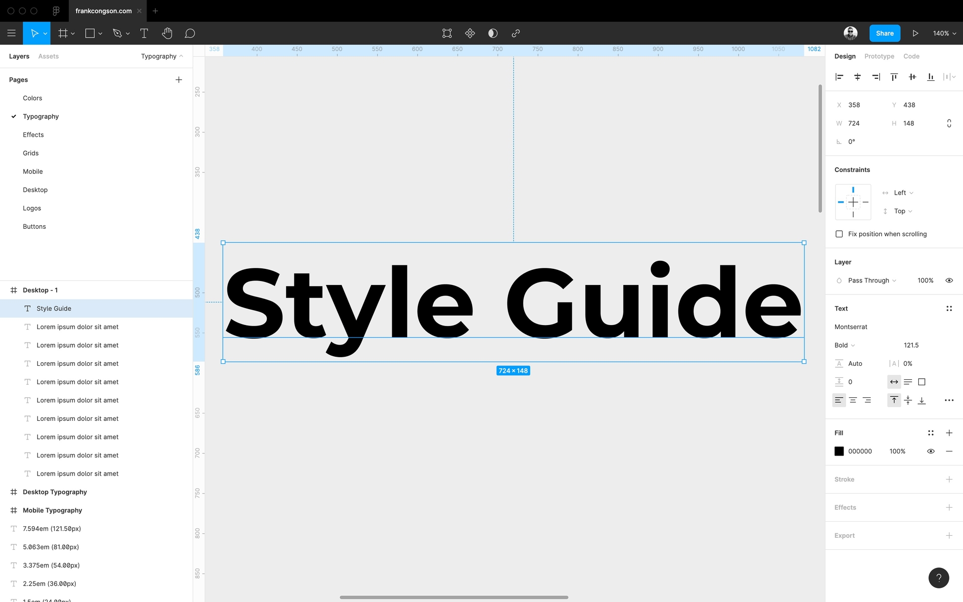
Design Style Guide

When I was in the early stages of reimagining what my website could look like, I began with getting my ideas out of my head and into Figma. It was the start of my journey into the designer space and the beginning of my very own design system. I choose the colors I would eventually introduce into my website, as well as typography and type scale that would represent all of the text on my website.
Once I had a few screens mocked in Figma, I began development. Soon after, I began diverging from the exact mockups I had created. As my website became real in the browser and window sizes were no longer static, I had to consider responsive design. It was this consideration that caused the divergence from Figma. I had begun tweaking the design based on what I saw in the real implementation within the browser and on mobile.
Benefits of a Style Guide
I began looking at the design system I had created in Figma less and less in exchange for referencing the code I had written. It felt more natural as my developer self began to take control of my designer self. What I soon realized was that it was getting difficult to keep things consistent by having to reference so many different files to remember how to style components.
To keep consistency across the website, I decided to create a dedicated style guide page. This page would contain all of the components I would create and showcase the different variations. Having all of the components on a single page allowed me to see at a glance that each piece came together to create a cohesive whole. As a bonus, I was also able to see the responsive behavior of each component.
Design and Development Workflow
While I find that balance between design and development, my current workflow has become creating quick mocks of my ideas in Figma. Fine-tuning of the design later happens during development to see how it feels within the website.