Design Systems Thinking

Design System Series: Part 2, Building with a Systems Mindset
Have a read of Part 1, Creating a Component Library.
Systems thinking
I began my systems thinking mindset when trying to maintain and scale existing UIs. The early days consisted of overwhelming finding and replacing through the entire codebase 😱. It wasn't easy to do. Next came global variables that centralized the properties used throughout the codebase. Now find and replace was only needed in one file 🙌. It's this consolidation of properties that creates the beginning of a system. If there's a good reason to consolidate properties into a central location, there's likely to be a reason to create a system out of those properties as well.
system /ˈsɪstəm/ noun
"1. a set of things working together as parts of a mechanism or an interconnecting network; a complex whole." — Oxford's English Dictionary
I decided to keep things simple at first and focus on the properties that I had initially centralized: colors and typography.
Colors

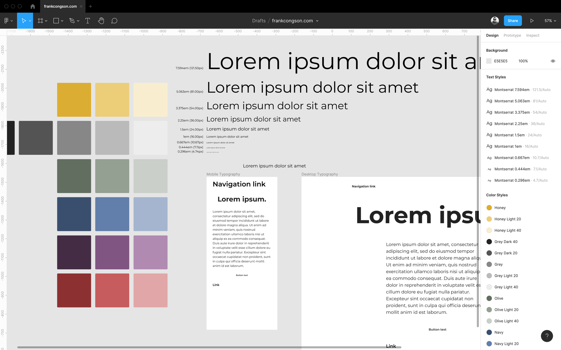
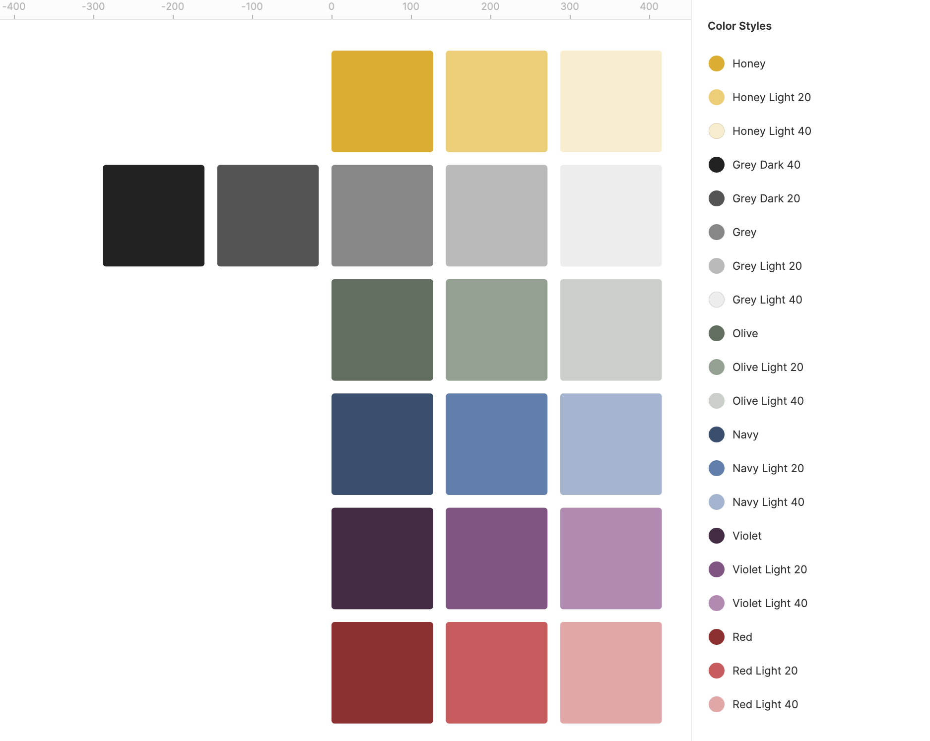
Here's where my systems thinking began to emerge. Colors provide meaning, and that meaning should be consistent across the application. Rather than choosing colors for a specific page or a specific element, I had to determine what cohesive set of colors I wanted to represent the entirety of the application. The different colors (yellow, green, blue, purple, red, etc.) all had to fit well together. The same goes for the different shades of each color. There are specific use cases of colors that need to be defined: brand color, highlight, primary, secondary, etc. I took the approach of finding the colors that fit well together and then slotting them into the specific use cases.
Typography

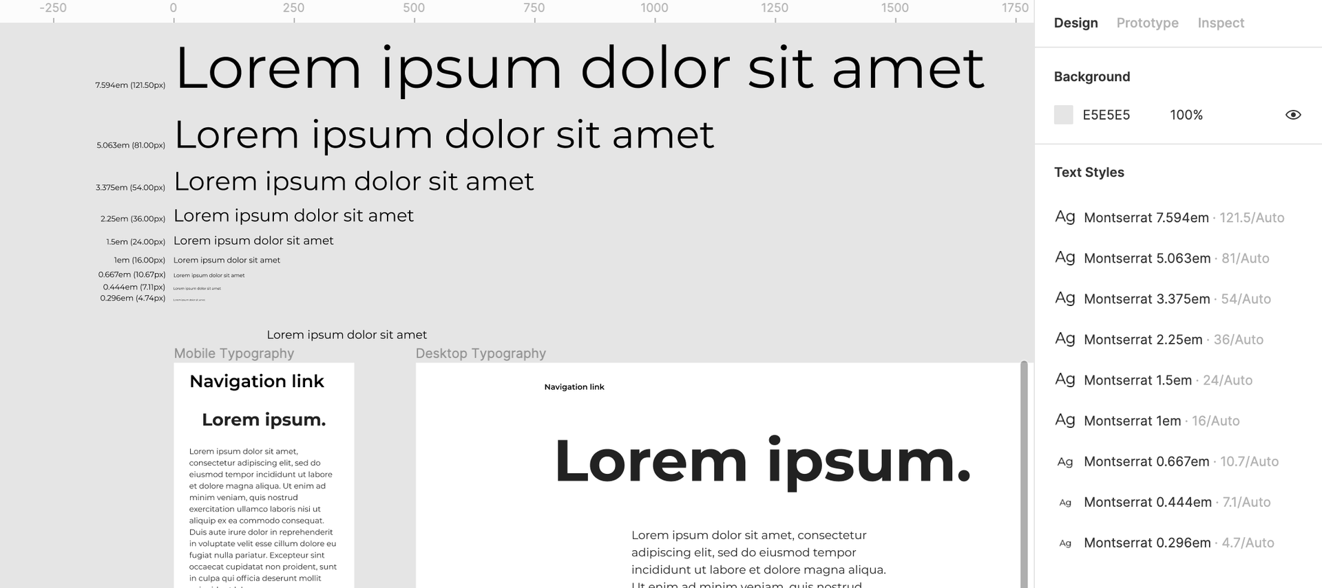
Typography represents a hierarchy for content. I learned that there are scales that present a better visual flow from one size to the next. To maintain a good visual flow within the application, I utilized the Type Scale tool by Jeremy Church and chose the "Perfect Fifth" scale. This scale allows me to have a base size of 16 px (1rem), as well as larger and smaller sizes for various headings, emphasis, and labels. Using a scale allows for typography that fits well together throughout the application.
Next steps
With a color system and typography system in place, I wanted to tackle integrating them into the application. Where it made sense for me to do this were the components and layouts that make up the building blocks of the whole.
Components
Components seemed like a great place to begin applying the color and typography systems I had established. It provided a small enough scope to simplify the application of the systems. Once I added color and typography to enough components, I was able to see the visual cohesion of the various components when placed together on a page (as seen here in my Style Guide).
Layouts
I realize that color and typography don't necessarily translate to layouts, except for maybe headers, but this led me to think of another system worth considering. When I began placing components on a page, I had to play around with how far each component sat from the other at each breakpoint. At the moment, I have applied various amounts of rems just from a glance which can get out of hand quite quickly without a proper system in place. In the future, I'll look into creating a more defined spacing system that I can apply to the layouts.
Know when to break the rules
Now that I had systems in place, it was time to apply them to my websites. These systems provide sensible defaults for new projects as well! And, with clearly defined rules on how to use these systems, I can understand when to break those rules and create variations for any sub-brands, i.e., the travel blog 🚞.