
Design Tokens To Dark Mode

Design System Series: Part 4, Designing dark mode with design tokens
Have a read of Part 3, Component Design In Figma.
Design Tokens
Design tokens solve several problems in the design system world. Those tokens are a codified representation of design decisions within the system. For instance, what is the brand color? The design tokens would let you know --brand-primary is a shade of olive green, --colors-olive-base: #626e60.
"Essentially, a design token is a design decision: a pairing of the same code and visual properties—design elements you use over and over again in your products—packaged in a format that’s deployable across all platforms." — Invision Inside Design
In addition to creating self-documented design decisions, design tokens establish a common language for those working within the design system. Collaboration between cross-functional disciplines, such as design and development, is greatly simplified.
Rather than communicating through hex code values, #626e60, or even by having to remember the correct color, --colors-olive-base, everyone can understand that when talking about the brand color, that color is --brand-primary. This is especially useful when implementing multi-brand design system implementations and rollouts of rebrands as well, although a topic for another time.
Dark Mode
Dark mode has become quite widespread. It's now a feature everyone expects from their favorite apps. At a high level, dark mode is a darker or dimmer look applied to a design, with light foregrounds against dark backgrounds. However, it's not a simple inversion of light mode colors. Each inversion is a design decision that plays very well with the application of design tokens.
The convergence of design tokens and dark mode presented an opportunity create the dark mode experience for my personal website, FrankCongson.com. I'm able to explore the practical implementation of design tokens to arrive at dark mode 🌘.
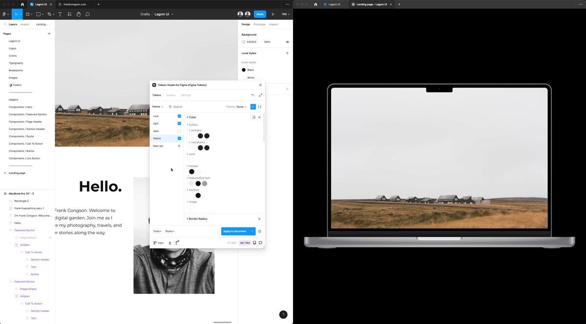
Tokens Studio for Figma
Continuing with my component creation in Figma, I began to create design token sets in the Tokens Studio for Figma plugin. This plugin, created by @EstherCheran and @six7 (thank you! 🙏), provides an effortless way of applying design tokens to Figma components.
First, I added existing Lagom UI styles (colors, typography) to the core token set. Second, I created semantic layers light and dark, which include tokens for foreground colors, background colors, accents, etc., to define specific usages of those core values. This semantic layer simplifies switching between light and dark modes as the chosen semantic layer is applied to the third token set, theme.

A closer look at the details
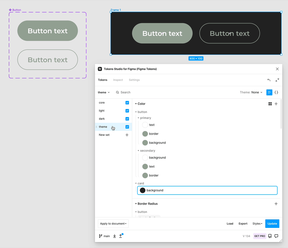
Let's take a closer look at applying dark mode to buttons. The core colors I use are:
--colors-white: #ffffff;
--colors-grey-darker40: #222222;
--colors-olive-lighter20: #94a092;
--colors-transparent: hsla(0, 0, 100, 0%);
For the light semantic layer, I define the following tokens.
--button-primary-bg: var(--colors-grey-darker40);
--button-primary-fg: var(--colors-white);
--button-secondary-bg: var(--colors-transparent);
--button-secondary-fg: var(--colors-grey-darker40);
I define equivalent tokens for the dark semantic layer with different core set values.
--button-primary-bg: var(--colors-olive-lighter20);
--button-primary-fg: var(--colors-white);
--button-secondary-bg: var(--colors-transparent);
--button-secondary-fg: var(--colors-olive-lighter20);
Finally, the applied theme defines the following tokens mapped to the semantic tokens.
--button-primary-text: var(--button-primary-fg);
--button-primary-border: var(--button-primary-bg);
--button-primary-background: var(--button-primary-bg);
--button-secondary-text: var(--button-secondary-bg);
--button-secondary-border: var(--button-secondary-fg);
--button-secondary-background: var(--button-secondary-fg);
Defining the light and dark token sets abstracts the core color values from the theme itself. The theme knows to apply --button-primary-text to the primary button text color. The exact color is determined based on the chosen light or dark mode.
Where I landed
My journey of adding design tokens to Figma got me to a dark mode design implementation of my landing page. The road to get there was not completely straightforward. I had to expand my color system to include more dark color shades. I'll have to revisit the color system since it is still in its early iterations. The scale from dark to light doesn't feel quite right and the accessibility could be improved. But for now, I'm happy with where I landed. I have a Figma implementation of design tokens with dark mode applied to my design system components ✨.

From Figma to code
At this stage of my design tokens journey it's time to get my Figma designs implemented in my code. Lagom Tokens now exists. Next, I'll add Style Dictionary to output CSS Custom Properties to use in my Lagom UI react components. Is it still a hand off 🤝 if the designer and developer are both me?
See you all in the next one. 👋