Lagom UI Logo Design

Conceptualization
The word "Lagom," which means "just the right amount," really spoke to me when I was naming my design system. I wanted to lean into the idea and only build what my use cases required. It felt right not to have the pretense of building an extensive design system that fit all situations.
Lagom (pronounced [ˈlɑ̂ːɡɔm]) is a Swedish and Norwegian word meaning "just the right amount".
Other concepts: minimalism, essentialism, balance
Other themes that I wanted to introduce into my logo were minimalism, essentialism, and balance. I wanted to achieve this through simple shapes, symmetry, and by only having a few elements.
Ideation
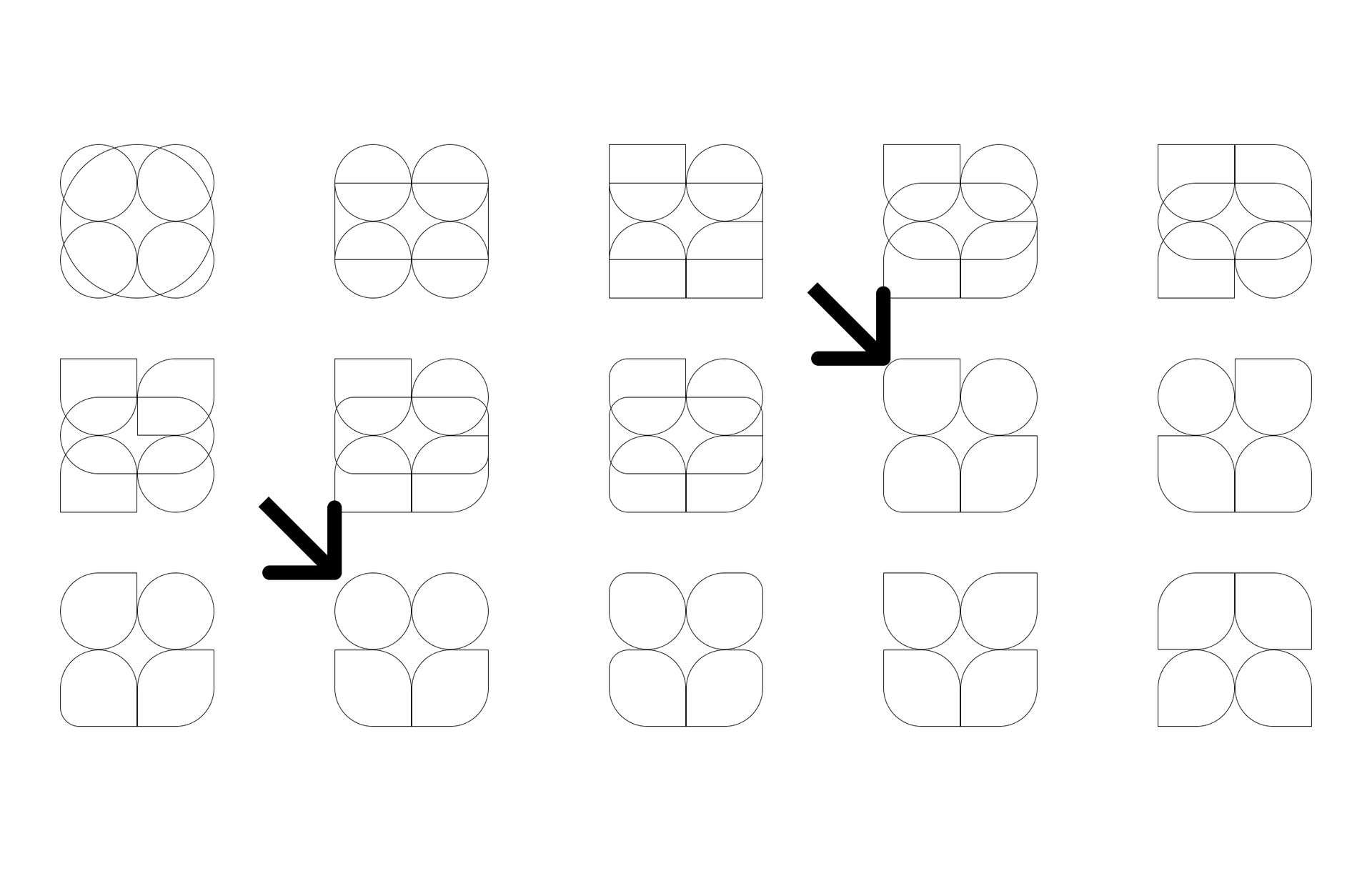
I started my ideation process by putting together a few simple shapes in Figma. I knew that I wanted the logo to be symmetrical and fit within a square. Beginning with four circles stacked on top of each other, I created a foundation of symmetry and balance. I then wanted symmetry and balance while maintaining an idea of essential elements. I updated each circle to create a different shape that still fits the space the original circle filled. Once I had a few variations to choose from, I landed on two options to move forward to the color stage.

Introducing color
I struggle to introduce color into designs, so this was a bit of a challenge. I already had a color palette to work with from my design system, which eased the challenge. I decided to give each shape a different color to represent the design system that I was building.


Final design
I ended with two strong options to choose from after I had added color to the logos. The final step was to add the logo title and ship the result.

Final final design
Of course, after a few days, I decided that I didn't like my original final logo design. It felt too flat. I still wanted to save the progress I've made and create a logo that fits the initial concepts and themes. The colors that I had chosen reminded me of the Aurora Borealis, so I decided to follow that lead.

Version 2 of my Lagom UI logo design maintained the idea of minimalism, symmetry, and balance. So far, it has stuck.

If you're interested, have a look at the component library I've built this logo for, Lagom UI. Also, if you would like to learn more about my journey building a design system, read Part 1 of my Design System Series, Creating a Component Library.