
Designing Glint like a camera
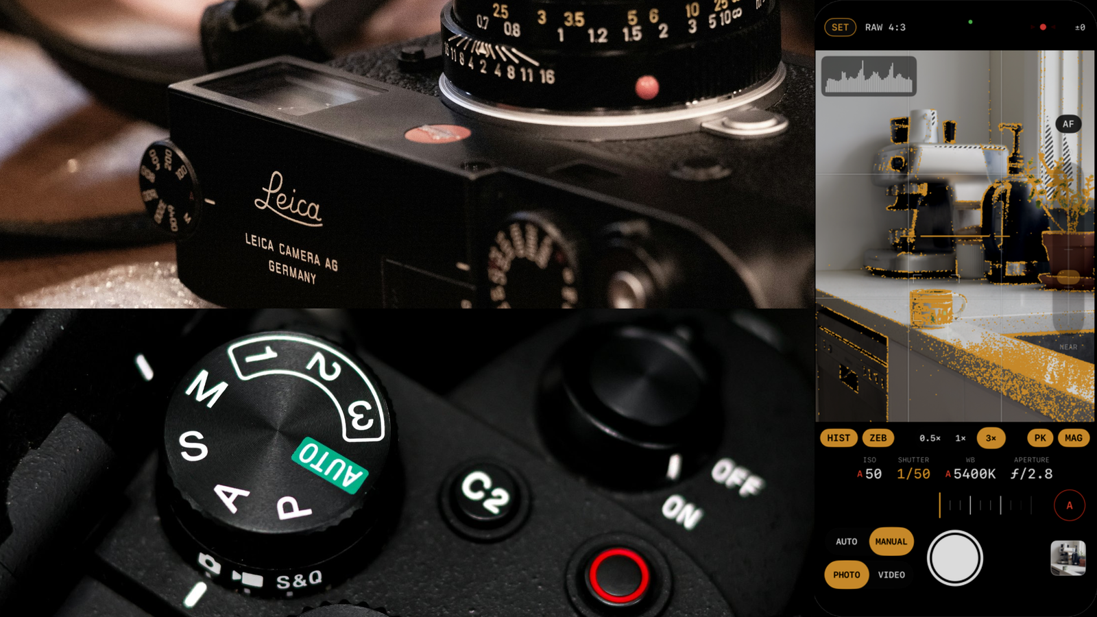
My design process has become significantly faster with AI. In the past, I would gather reference images into Figma and use them to narrow down the design I was looking for, before I could start thinking about what to mock up. Now I can throw those reference images at Claude, and we go straight to mockups and iterate quickly. It was also fun. I spent my time looking at photos of cameras. I love the look of vintage cameras and their tactile dials, and there were so many great options to copy steal from 😆.
"Good artists copy; great artists steal." — probably Pablo Picasso
This post is about how I designed Glint, my raw-first iPhone camera app. Have a read of the first post if you want the whole story.
The rule
Function and form — the app had to function like a camera, and its form had to say "camera" 📷.
First, it had neither function nor form
Before I started any real design iteration, Claude had built a camera app that didn't feel like a camera at all. It looked like a form. The first run on my phone was a plain SwiftUI form over a live preview, with two toggles and two unlabelled sliders. My next prompt to Claude was the start of the design cycle.
"I'd love to iterate on the stylings of the controls. It would be great to make it feel more like a real camera." — My prompt to Claude
Within minutes, it had yellow RAW and M chips, a 4:3 viewfinder, and monospaced ISO, SHUTTER, and APERTURE readouts. After a few more iterations, it had tap-to-focus and a histogram chip.
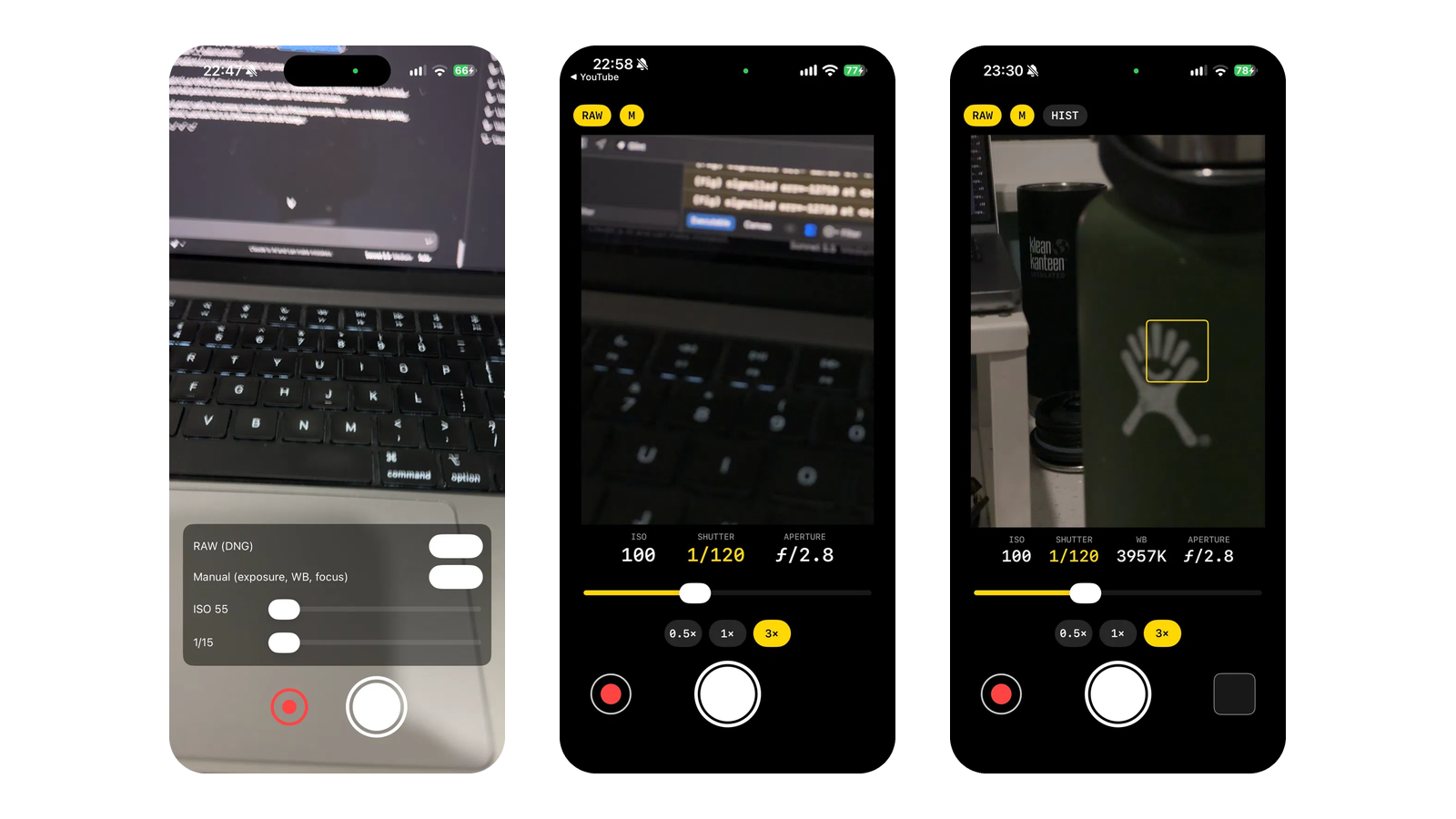
And by the end of the night, the histogram had its own spot in the corner of the viewfinder.
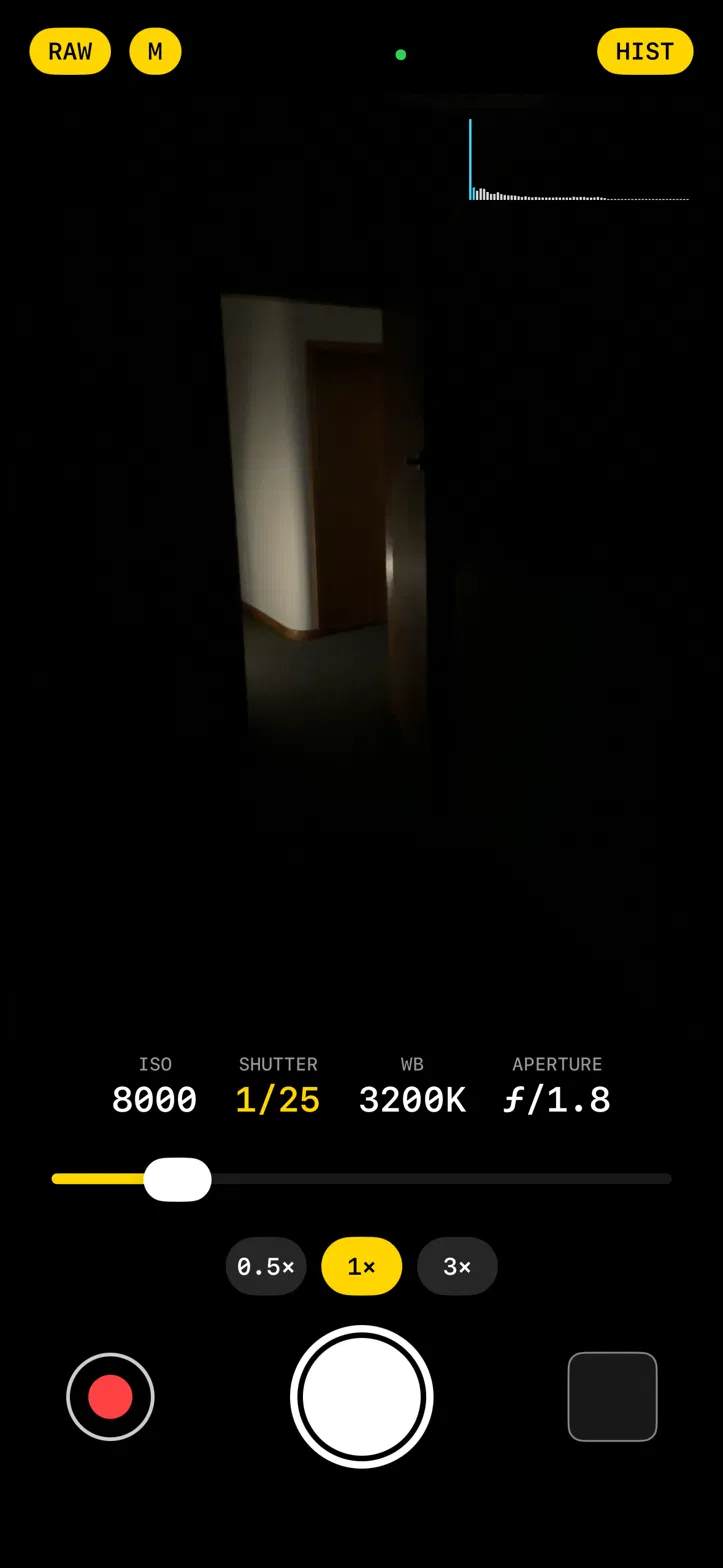
Design iterations were moving quickly. It had the basic function and form of a camera.
Inspiration from a Leica
I wanted to improve the UX and the interactions for Glint's manual controls. The single slider wasn't very intuitive, and it made sense to follow the familiar way physical cameras handle those controls — specifically the Leica M.
"Jakob's Law (also known as the Law of Familiarity) states that users spend most of their time on other sites and apps, so they expect a new product to work the same way as familiar ones" — Laws of UX
I gave Claude images for inspiration and quickly got mockups for several options to choose from. It was great getting those mockups from Claude. They were even interactive, so I could get a feel for the interactions. That alone would have taken me days in Figma.
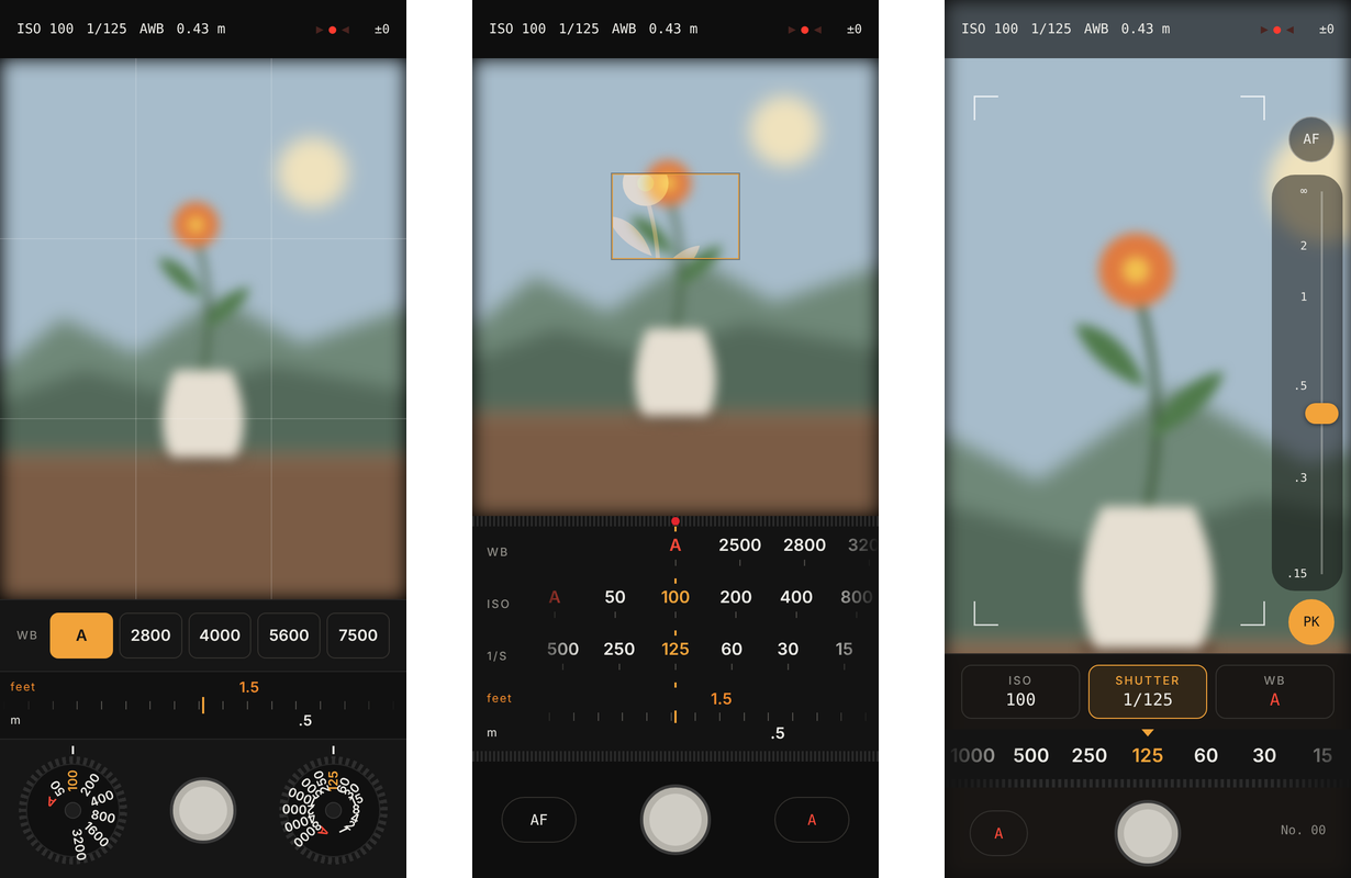
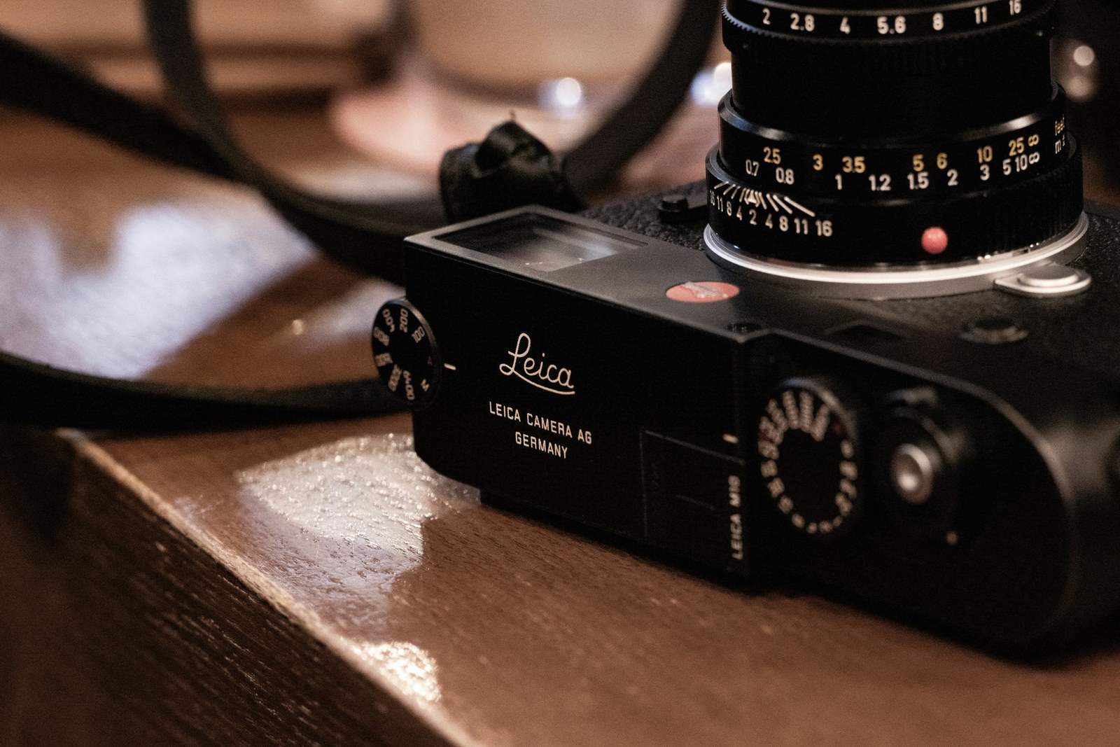
What I took from a Leica M (the image above is an M10, but the controls are the same):
- The distance scale ending in ∞ became the model for the NEAR to ∞ focus rail.
- The A beside the ISO and shutter values. Auto is a position on the dial. In Glint, any setting can be on A: ISO on A gives shutter priority, shutter on A gives ISO priority, both give program, and the ruler then sets exposure compensation.
- The meter. The ▶ ● ◀ LEDs with the offset in stops became the exposure meter in the top bar.
Of the mockups Claude presented, I chose C. It made the best use of space while still feeling familiar. The viewfinder fills the screen, the focus rail sits on the right edge (close to the image you're focusing on, while covering as little of it as possible), and one wheel adjusts the selected manual setting. I did like the twin dials in A, but turning those tiny dials on a touchscreen seemed difficult. The touch targets were too small, a limitation of touch interfaces. B just took up too much screen real estate.
The iPhone's fixed aperture
My iPhone 15 Pro has no adjustable aperture, so the Leica's depth-of-field scale has no equivalent. Glint shows the lens's f-number read-only, because the only way to change it is to change lens. The iPhone 18 Pro now has an adjustable aperture, which is obviously a very good reason to upgrade — for research 😉.
User testing and fast iterations
Once I had the Leica-inspired designs coded, built, and installed on my phone, it was time to do some real user testing. That user being me 🤝.
Here are the five improvements that came out of it. Each started as a mockup, then I tested it out on my phone to make sure the change improved the issue I was having.
1. The chips over the viewfinder were unreadable
On a bright scene, I noticed HIST, ZEB, PK, and MAG were hard to read. They were drawn straight over the viewfinder. When off, they were bare white text that disappeared against the brightness, and the Dynamic Island clipped some of them.
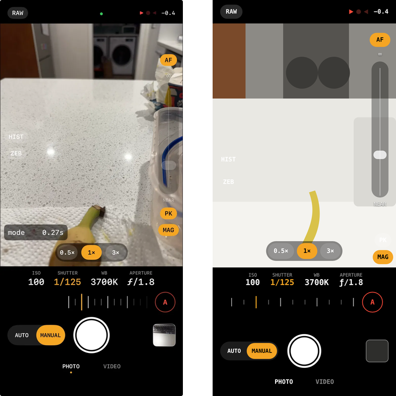
I decided that information belongs around the viewfinder, the way it does on a camera. I asked Claude to mock up two ways to do it: a tool row under the viewfinder, and the same row with the lens picker in it.
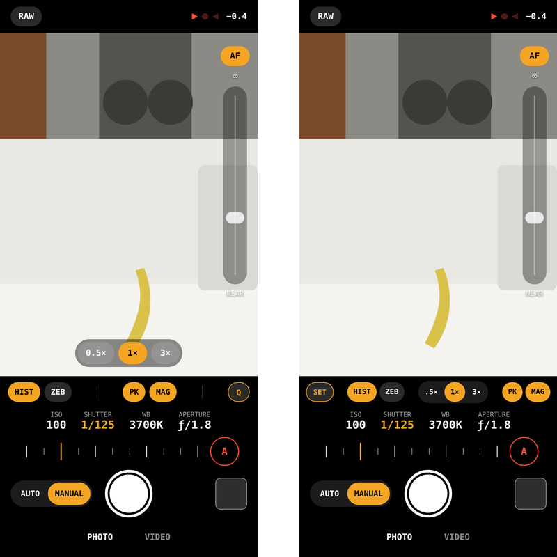
I chose B — the compact row with lenses. Asking for two options made the lens picker the deciding difference. In A, it still sat on the viewfinder. In B, only AF and the focus rail stay on the viewfinder. Here's the before and after.
2. The settings I rarely change needed a home
Taking the chips off the viewfinder left a problem: where do the settings I don't change often go? Until then, some of them lived in touch-and-hold menus on PK and ZEB. Cameras solve this with a quick menu, plus custom buttons for the few things you toggle often.
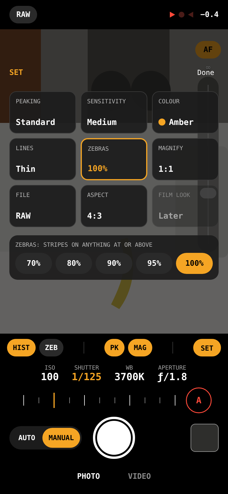
Fuji, Canon, and Panasonic call theirs Q. Sony uses Fn. In the first mockup, the button was labelled Q. I asked Claude why, then asked for a different name. SET was one of the options Claude gave me, and I liked that it's shorthand for "settings". It also borrows no brand's label and fits Glint's all-caps labels. Its first version was nine tiles — tap one and its choices appear underneath.
3. The viewfinder got smaller, so the mode switch moved
As soon as I used the tool row version on the phone, I noticed the viewfinder had got smaller. It was losing space to the tool row. SET moved to the top bar beside the format shown as plain text (the RAW chip looked out of place), and I needed somewhere else for PHOTO | VIDEO, so I asked for two places to put it.
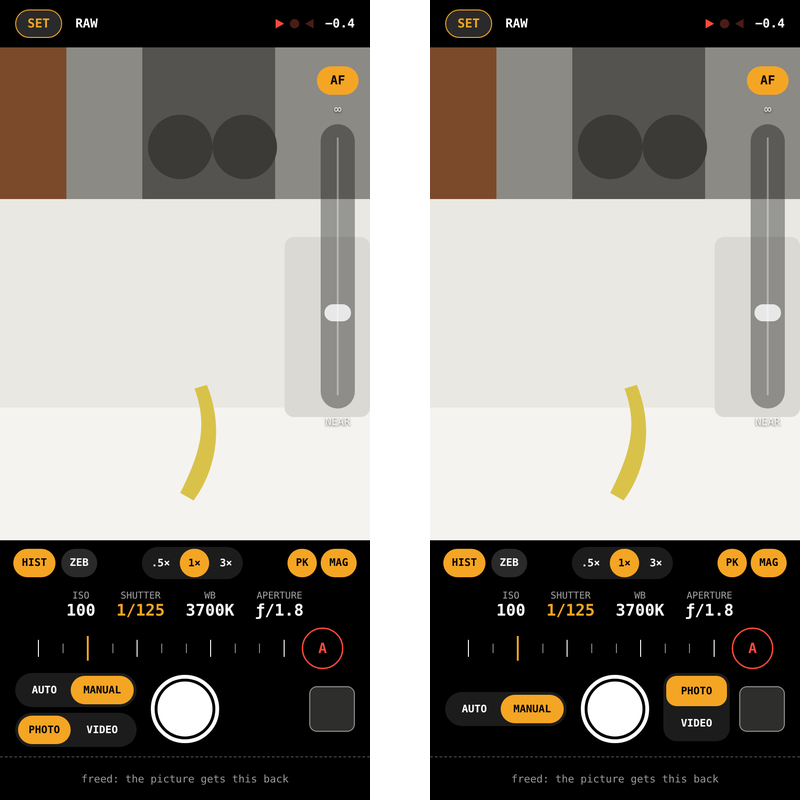
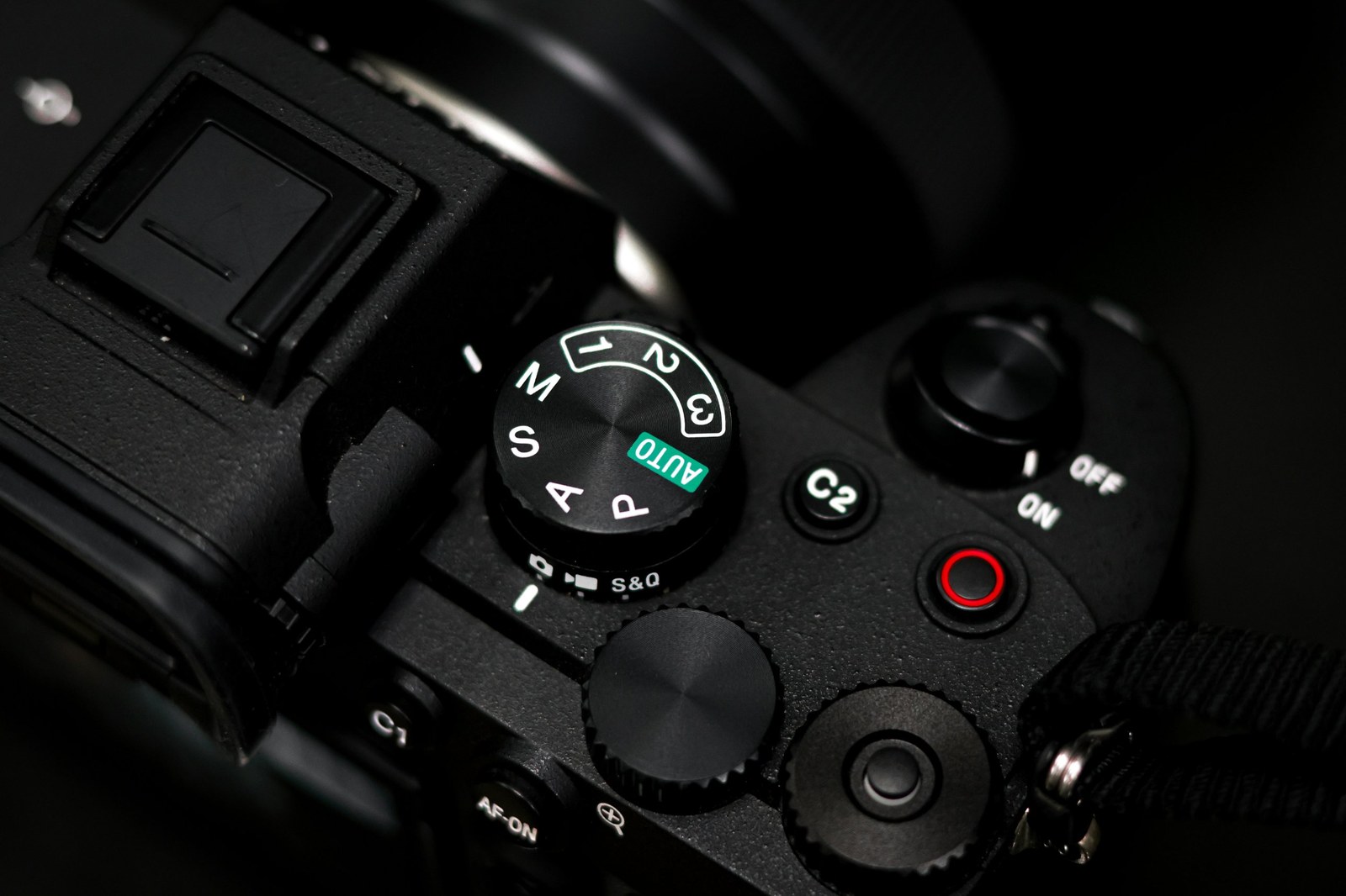
I decided on the left stack: AUTO | MANUAL over PHOTO | VIDEO, beside the shutter. It mirrors Sony's mode dial with its photo, movie, and S&Q collar underneath, and it gave the bottom strip back to the viewfinder.
4. Landscape was a mess
Rotating every label with the phone made chips overlap and left the focus rail along the top.
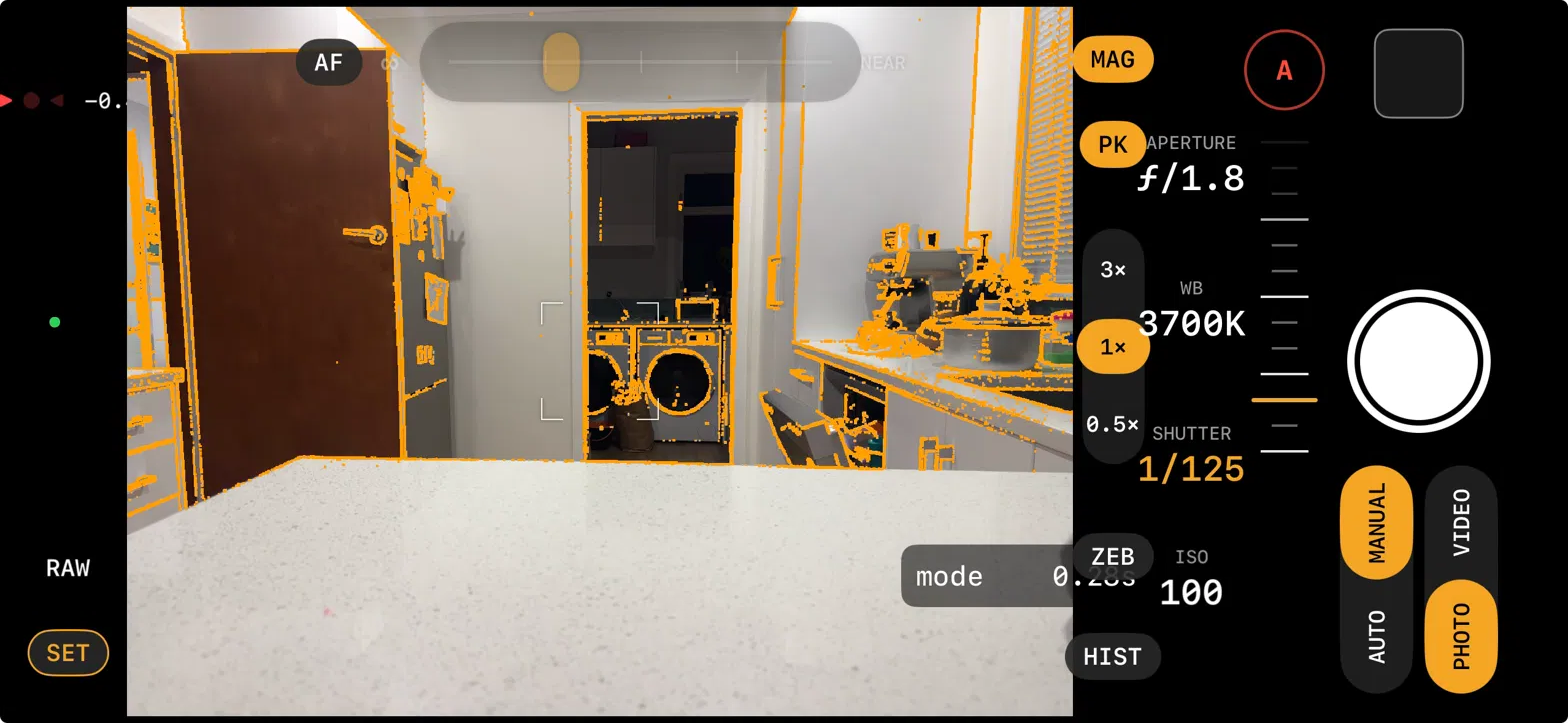
I didn't mock this one up. I decided it on the phone. Controls don't rotate on a physical camera, so I did the same in my camera app. Only the focus rail moves, to the side you choose (a setting in SET), turned so ∞ is up.
5. SET wasn't obvious
The tiles worked, but tapping one showed its choices in a panel along the bottom, and nothing tied the two together.
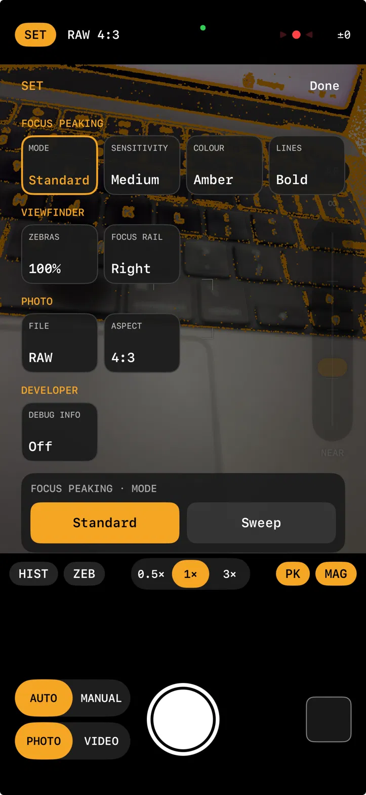
"I want to improve the SET UX. It wasn't obvious to me that the bottom row was the options for the currently selected setting." — My prompt to Claude
Claude had designed that menu, and I couldn't tell how it worked. If I couldn't tell, anyone new to the app would struggle too. Claude's answer was three options, as mockups.
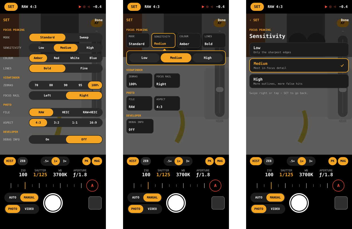
I chose rows, the one where every choice is visible. Each setting names itself and shows every choice as a segmented control, like a digital camera's menu system. The expanding version needed a pointer arrow to tie its choices to the tile, and the drill-in version hides everything else. I didn't like the additional steps to find the setting I wanted. I just wanted to get to the setting fast.
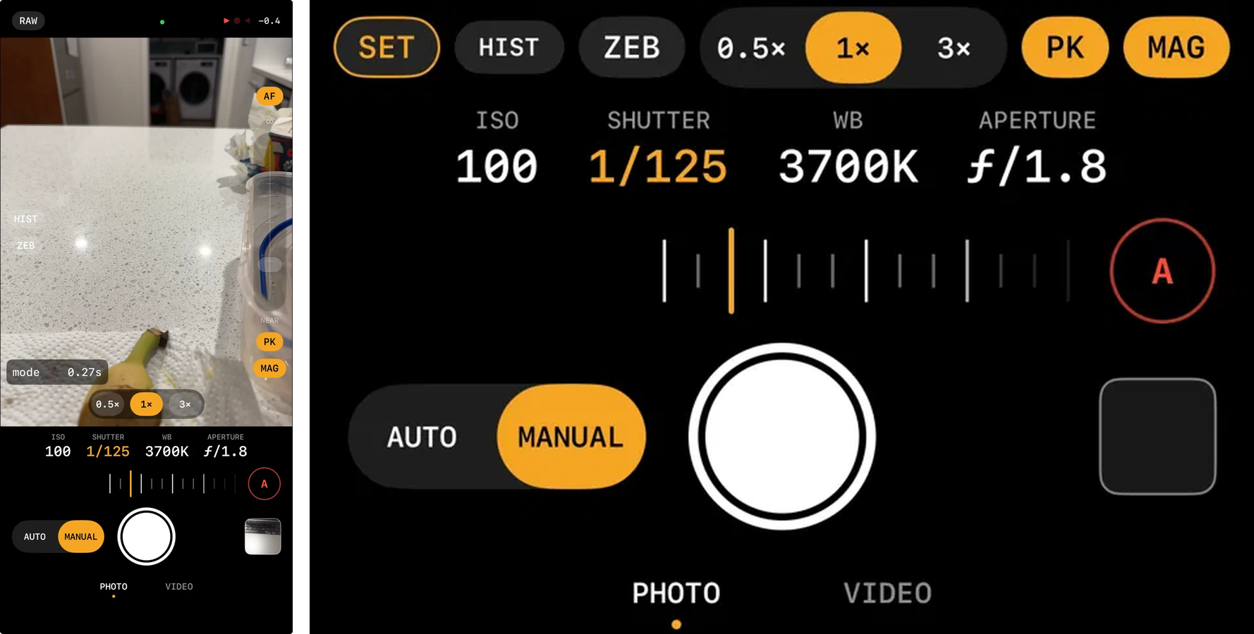
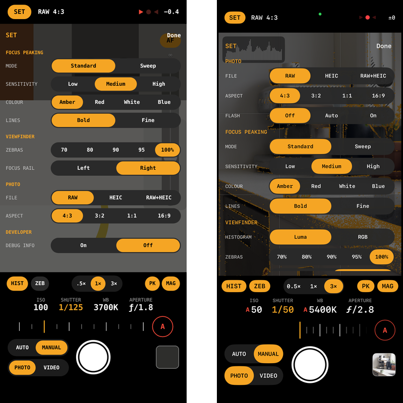
The mockup next to what shipped:
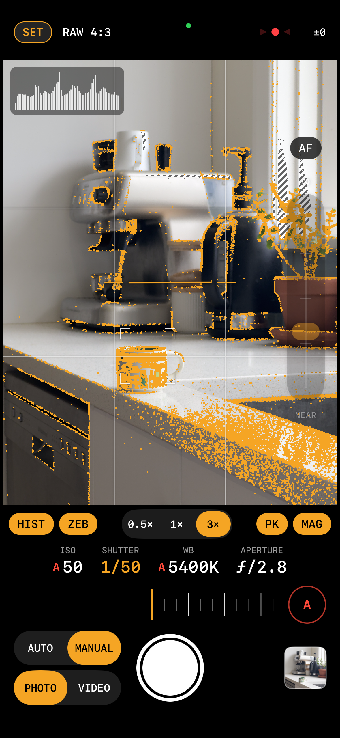
Here's where the design ended up — the tool row under the viewfinder, SET and the exposure meter in the top bar, the mode stack by the shutter, and the focus rail on the edge.
App experience enhancements
The design of Glint has come a long way in a short amount of time, and I wanted the app to feel polished. That meant improving the experience outside the app too, the way you get into it: how the icon looks on the Home Screen, and how the Glint control looks on the Lock Screen and in Control Centre. I took both through the same design loop as the controls, with additional design iterations for each.
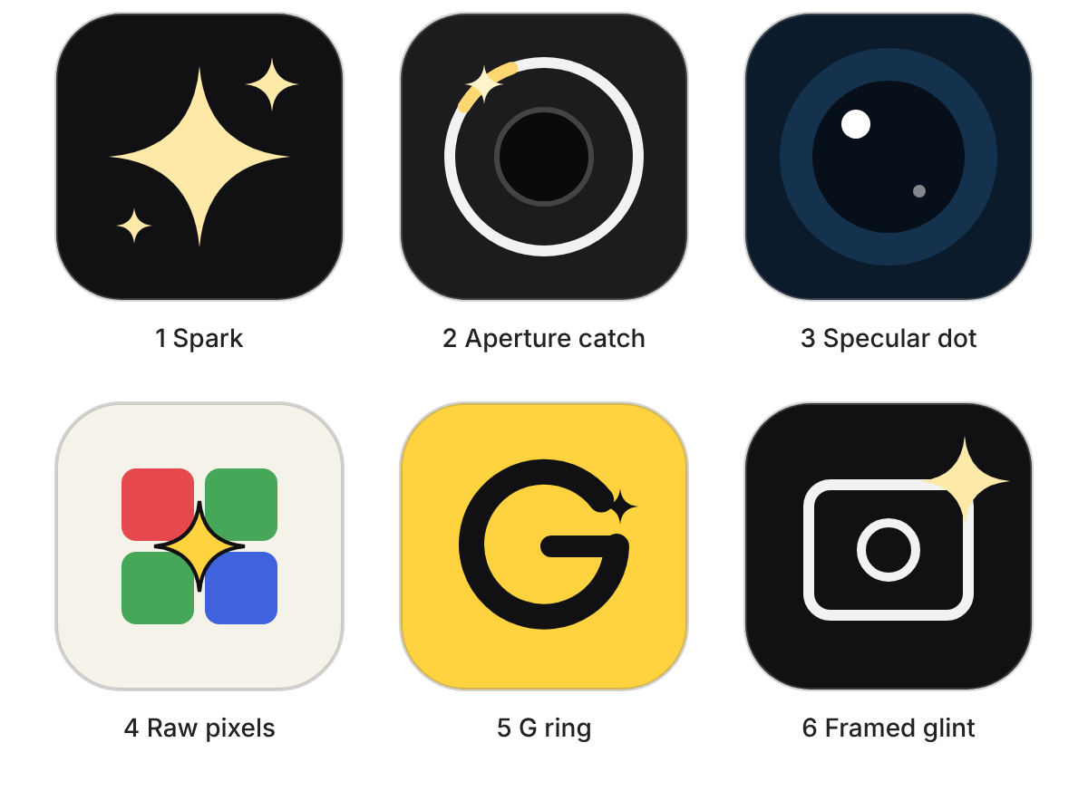
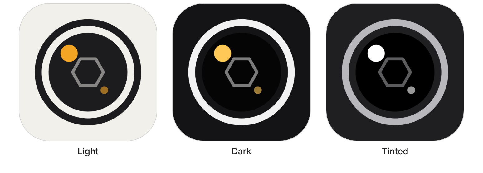
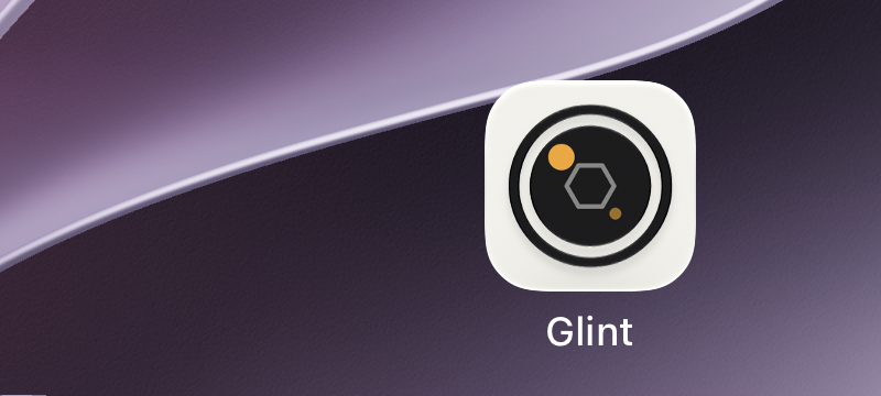
The app icon. I wanted it to say "camera" at a glance and to work in light, dark, and tinted modes. It started life as a placeholder sparkle, then went through five rounds in one evening.

1. Six directions, all built around the name (a glint is a small catch of light): a spark, an aperture, a specular dot, Bayer pixels, a G monogram, and a framed glint.
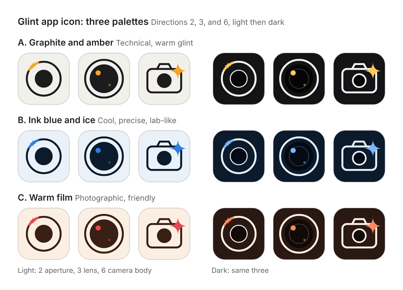
2. Three palettes. I liked three of the six directions but wasn't sure about palette or tone, so I asked to see options. I chose graphite and amber: technical, and the amber reads as light and not decoration.
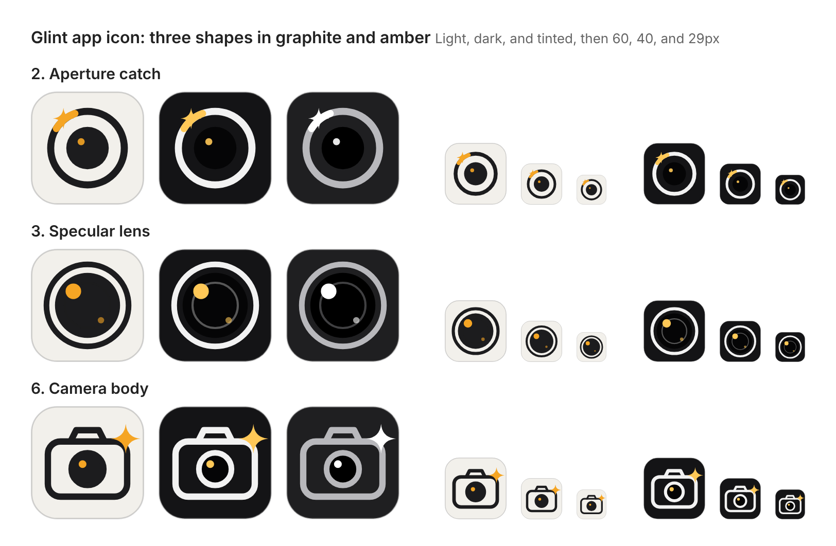
3. Three shapes, tested at 60, 40, and 29 px. I chose the specular lens, which was the calmest and survived shrinking, but it was the weakest "camera" cue.
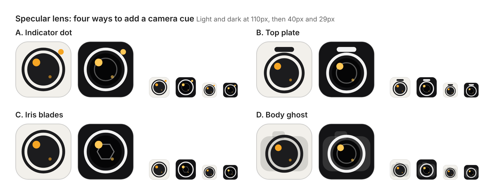
4. Four ways to add a camera cue. Once I'd chosen the specular lens, I asked how to make it read more like a camera, which is where the four cues came from. I didn't understand the top plate at first, so I wanted to see why before ruling it out. I chose iris blades, a hexagon inside the lens.
5. The final icon. The first export had a bug: the highlight dot overlapped a corner of the hexagon and looked accidental, so I shrank the hexagon and moved the dot.
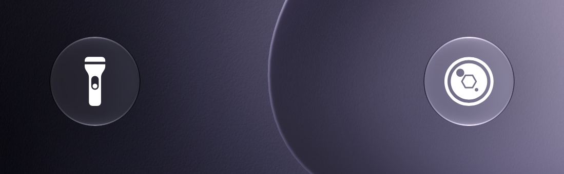
The Lock Screen glyph. The Lock Screen control first used a generic system aperture symbol, which looked like every other camera app. I rebuilt it from the app icon's own shapes, and it took six passes in a short afternoon session: an off-centre hexagon, a centred one, a lighter one, a custom symbol (the PNG showed up as a question mark), a version drawn like the icon, and a final one scaled up to match its neighbours in Control Centre.

What's next
I still have ideas from my references that aren't built yet. Most are small details in how the controls look and feel, like the ticks and numerals on a Leica's focus scale, plus a few camera features like separate focus and exposure lock buttons.